Multiselect
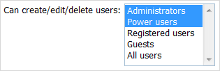
Presents a multi-select list box.
Attributes
- className - (string) the user-defined css class for item
- inputHeight - (integer or auto) the height of input. The default value is auto
- inputLeft - (integer) sets the left absolute offset of input. Just position:“absolute” makes sense of the attribute
- inputTop - (integer) sets the top absolute offset of input. Just position:“absolute” makes sense of the attribute
- inputWidth - (integer or auto) the width of input. The default value is auto
- label - (string) the text label of item
- labelAlign - (left, right or center) the alignment of label within the defined width
- labelHeight - (integer or auto) the height of label. The default value is auto
- labelLeft - (integer) sets the left absolute offset of label. Just position:“absolute” makes sense of the attribute
- labelTop - (integer) sets the top absolute offset of label. Just position:“absolute” makes sense of the attribute
- labelWidth - (integer or auto) the width of label. The default value is auto
- name - (string) the identification name. Used for referring to item
- offsetLeft - (integer) sets the left relative offset of item (both input and label)
- offsetTop - (integer) sets the top relative offset of item (both input and label)
- options - specifies select options of item
- selected - (boolean) specifies whether the option will be selected initially
- text - (string) the value of option
- value - (string) the id of option
- position - (label-left, label-right, label-top or absolute) defines the position of label relative to input
- style - (string) specifies css style of item
formData = [
		{type: "multiselect", label: "Can create/edit/delete users:", inputHeight:90, inputWidth:130, options:[
		      {text: "Administrators", value: "Option 1", selected: true},
		      {text: "Power users", value: "Option 2", selected: true},
		      {text: "Registered users", value: "Option 3"},
		      {text: "Guests", value: "Option 4"},
		      {text: "All users", value: "Option 5"},
		]}
];