combo
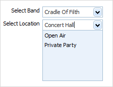
dhtmlxCombo integration. Presents a normal combo box.
Please note, to use combo item you must include several dhtmlxCombo related files:
1.If you use dhtmlxCombo standalone you need to include 3 files:
<script src="../codebase/dhtmlxcombo.js"></script>
<script src="../codebase/ext/dhtmlxform_item_dhxcombo.js"></script>
<link rel="stylesheet" type="text/css" href="../codebase/dhtmlxcombo.css">
2.If you use dhtmlxCombo as a part of 'dhtmlxSuite' package you need to include 2 files:
<link rel="STYLESHEET" type="text/css" href="../codebase/dhtmlx.css">
<script src="../codebase/dhtmlx.js" type="text/javascript"></script>
Form supports combo nesting, i.e. you can set different items for different options. Subject to the selected option - the appropriate set of items will be shown.
Attributes
- className - (string) the user-defined css class for item
- inputHeight - (integer or auto) the height of input. The default value is auto
- inputLeft - (integer) sets the left absolute offset of input.Just position:“absolute” makes sense of the attribute
- inputTop - (integer) sets the top absolute offset of input. Just position:“absolute” makes sense of the attribute
- inputWidth - (integer or auto) the width of input. The default value is auto
- label - (string) the text label of item
- labelAlign - (left, right or center) the alignment of label within the defined width
- labelHeight - (integer or auto) the height of label. The default value is auto
- labelLeft - (integer) sets the left absolute offset of label. Just position:“absolute” makes sense of the attribute
- labelTop - (integer) sets the top absolute offset of label. Just position:“absolute” makes sense of the attribute
- labelWidth - (integer or auto) the width of label. The default value is auto
- name - (string) the identification name. Used for referring to item
- offsetLeft - (integer) sets the left relative offset of item (both input and label)
- offsetTop - (integer) sets the top relative offset of item (both input and label)
- options - specifies select options of item
- list - defines the array of nested elements
- selected - (boolean) defines whether the option will be selected initially
- text - (string) the text of option
- value - (string) the id of option
- position - (label-left, label-right, label-top or absolute) defines the position of label relative to input
- value - (string) the initial value of item
var formData = [
		{type: "combo", name: "myCombo", label: "Select Band", options:[
				{value: "opt_a", text: "Cradle Of Filth"},
				{value: "opt_b", text: "Children Of Bodom", selected:true}
		]},
		{type: "combo", name: "myCombo2", label: "Select Location", options:[
				{value: "1", text: "Open Air"},
				{value: "2", text: "Private Party"}
		]}
];