calendar
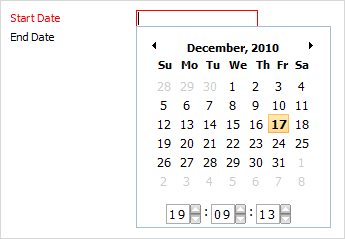
dhtmlxCalendar integration. Presents date field with pop-up calendar.
Please note, to use calendar item you must include several dhtmlxCalendar related files:
1.If you use dhtmlxCalendar standalone you need to include 6 files:
<script src="../codebase/dhtmlxcalendar.js"></script>
<link rel="stylesheet" type="text/css" href="../codebase/dhtmlxcalendar.css">
<link rel="stylesheet" type="text/css" href="../codebase/skins/dhtmlxcalendar_dhx_skyblue.css">
<script src="../codebase/ext/dhtmlxform_item_calendar.js"></script>
2.If you use dhtmlxCalendar as a part of 'dhtmlxSuite' package you need to include 2 files:
<link rel="STYLESHEET" type="text/css" href="../codebase/dhtmlx.css">
<script src="../codebase/dhtmlx.js" type="text/javascript"></script>
Attributes
- calendarPosition - (bottom or right) sets the position pop-up calendar will appear from. The default value is bottom
- className - (string) the user-defined css class for item
- dateFormat - (string) sets format of date presentation in input
- inputHeight - (integer or auto) the height of input. The default value is auto
- inputLeft - (integer) sets the left absolute offset of input.Just position:“absolute” makes sense of the attribute
- inputTop - (integer) sets the top absolute offset of input. Just position:“absolute” makes sense of the attribute
- inputWidth - (integer or auto) the width of input. The default value is auto
- label - (string) the text label of item
- labelAlign - (left, right or center) the alignment of label within the defined width
- labelHeight - (integer or auto) the height of label. The default value is auto
- labelLeft - (integer) sets the left absolute offset of label. Just position:“absolute” makes sense of the attribute
- labelTop - (integer) sets the top absolute offset of label. Just position:“absolute” makes sense of the attribute
- labelWidth - (integer or auto) the width of label. The default value is auto
- name - (string) the identification name. Used for referring to item
- offsetLeft - (integer) sets the left relative offset of item (both input and label)
- offsetTop - (integer) sets the top relative offset of item (both input and label)
- enableTime - (boolean) defines whether in the bottom of calendar, time manage elements will be presented
- position - (label-left, label-right, label-top or absolute) defines the position of label relative to input
- readonly -(boolean:true/false or 0/1) specifies whether item's value can be changed by button click in browser (meanwhile, item's value can be changed programmatically anytime)
- serverDateFormat - (string) the format in which the date is stored on server
- value - (string) the initial value of item
- weekStart - (from 1 to 7) sets the start day of a week. '1' relates to Monday and '7' to Sunday.
var formData = [
		{type: "calendar", dateFormat: "%Y-%m-%d %H:%i", name: "start_date", label: "Start Date", className: "my_calendar", readonly:true},
		{type: "calendar", name: "end_date", label: "End Date"}
];